Colour can soften a busy city home, but the most convincing palettes are coordinated with daylight, materials, furnishings and the people who use the space.
Interior Design Hong Kong: A Calm Colour Palette for Urban Homes addresses a practical question for Hong Kong households. The useful starting point is not a trend or a mood board; it is a brief that connects space, users, routines and technical constraints. This guide breaks the decision into manageable steps.
In Hong Kong, compact floor plates, multi-storey buildings, building-management rules and demanding everyday operations can shape what is practical. A solution that looks convincing in a render should still be tested against actual site dimensions, access, maintainability and the people who will use it.
What matters most in practice?
1. Choose an anchor material first
Flooring or a retained timber finish often sets the undertone of a room. Build the remaining neutrals around it. A palette selected from screen swatches alone may clash with existing stone, furniture or daylight.
2. Test colour in changing light
View paint cards on more than one wall and at different times. Warm light, overcast afternoons and neighbouring reflections can alter perception. Test before committing large surfaces.
Before committing to this stage, put the preferred option next to at least one workable alternative. Compare not only first impression and cost, but also how each choice changes cleaning, operations and future adjustments. A clear comparison keeps the discussion centred on outcomes.
3. Use contrast to improve clarity
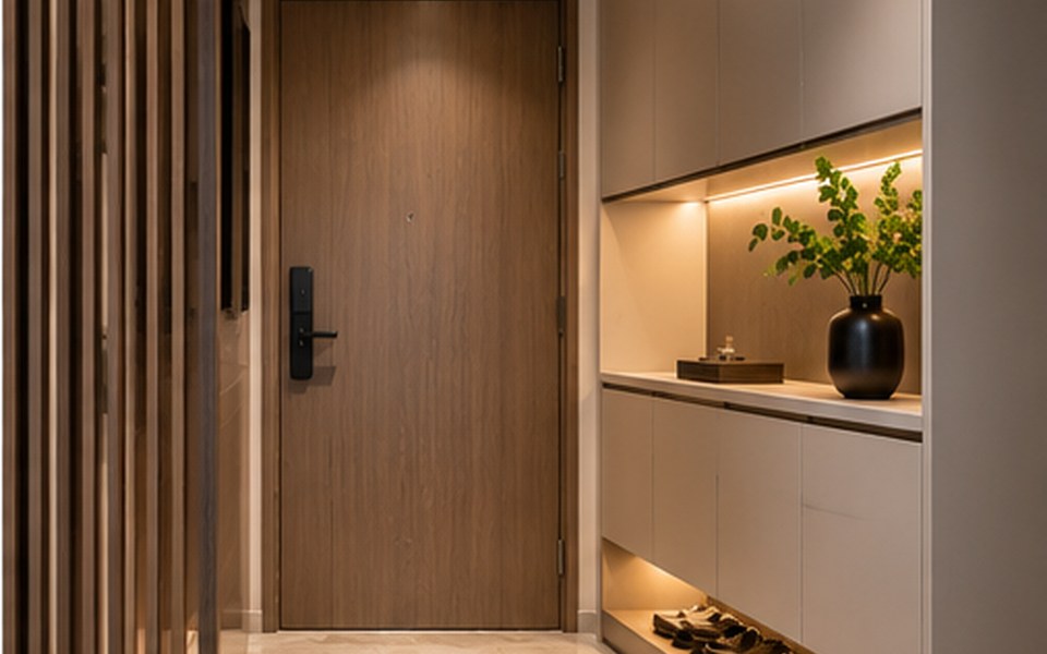
Dark accents can give definition to handles, furniture and focal walls. Overly uniform pale rooms may lack depth, while too many competing feature colours can make a small home feel restless.
4. Plan for wear and personal objects
Consider the cleanability of high-touch surfaces and how artwork or textiles will evolve. A restrained backdrop is useful when the household enjoys collecting objects or changing decorative pieces.
Example: turn the brief into a workable option
A hypothetical planning scenario
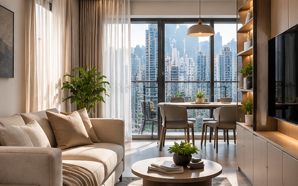
A home with grey stone flooring and teak furniture might use layered warm whites, muted green and a small black accent. The aim is a consistent relationship between existing materials and new additions.
The scenario is illustrative rather than a documented client project. For any real property, the scope should be reviewed through a site survey and professional coordination before construction or procurement.
Common mistakes to avoid
- Approving a concept without reviewing choose an anchor material first. Ask the team to explain the practical consequence, who is responsible for the decision and how it will be checked before installation.
- Overlooking the practical effect of test colour in changing light. Ask the team to explain the practical consequence, who is responsible for the decision and how it will be checked before installation.
- Finalising purchases before checking plan for wear and personal objects. Ask the team to explain the practical consequence, who is responsible for the decision and how it will be checked before installation.
Designer briefing checklist
Bring the following to the first project discussion. Specific information makes it easier to compare proposals and prevent expensive assumptions.
- A measured plan and a short description of choose an anchor material first.
- Photographs or samples relevant to test colour in changing light.
- A written priority list covering use contrast to improve clarity and approval responsibilities.
Also clarify the intended users, target completion window, overall budget constraints and who may approve changes. Discuss the site with the building manager early if the work could affect shared services, structure, fire safety, access, waterproofing or other regulated elements.
Frequently asked questions
Are neutral colours always safer for resale?
They may appeal broadly, but condition, workmanship and functionality also shape buyer impressions.
Can a dark colour work in a small room?
Yes, when lighting, proportion and adjoining finishes support it.
Should every room use the same colours?
Related undertones can create continuity, while different rooms may have distinct moods.
Next step
Use the checklist to create a concise project brief, then confirm the plan against the specific property and its constraints. If you want to discuss design and implementation, explore interior design and planning services, browse the studio’s portfolio and contact the team through the official enquiry page. This is general educational content, not a substitute for project-specific building or safety advice.